Archive for January, 2014

January 30, 2014 — The Fed Supports Market, Despite Taper

Thursday, January 30th, 2014

small latest logo

-1 -1  -1  ten day advance of value shows support for declining market   01302014

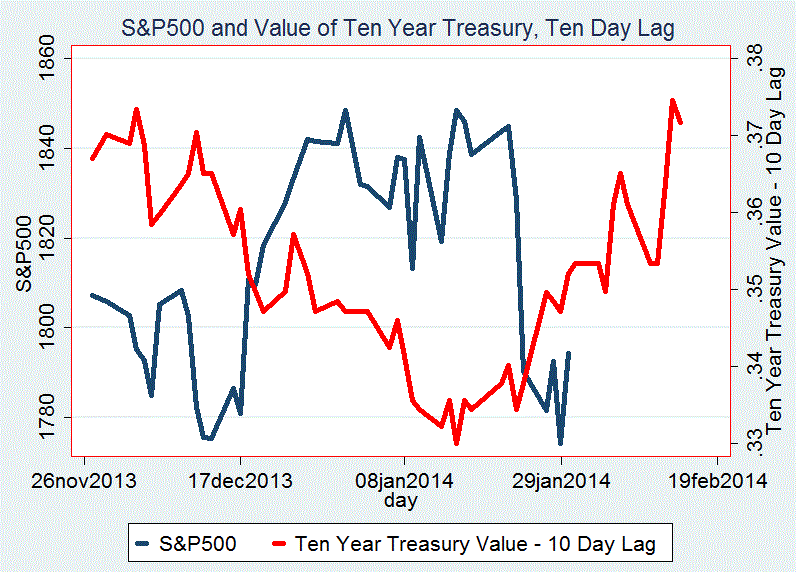
Anyone who thinks the Fed’s policy of taper –reducing its Treasury purchases as the economy improves- steams ahead despite the faltering stock market needs to consider the recent history of that interest rate. Our diagram reveals a sharp reversal –lower yields on the Ten Year Treasury- since the S&P500 peaked earlier this month.
The two lines on today’s figure compare the S&P500 closing prices with the ten day lagged value of the Ten Year Treasury paper. The ‘value’ being the inverse of the daily interest rate of that Treasury debt.

Note how the value changes direction just about where the S&P500 hit its recent top. None of this means that the Fed will allow stock prices to continue their record climb. However, it seems reasonable to assume that Bernanke –nor his new replacement- will let a sharp stock price decline tarnish their image, let alone allow financial markets to nip the economy’s weak recovery at this early stage of the business upswing.

DJIA .70 percent
NASDAQ 1.77 percent
S&P500 1.13 percent

c max moszer

January 29, 2014 Fourth Loss in Last Five Sessions

Wednesday, January 29th, 2014

small latest logo

five day percent change sadj

Prices dropped more than one percent, more than wiping out yesterday’s uptick, leaving the S&P500 down -3.83 percent since five days ago. Yet when putting this wipeout in perspective, we recognize that it’s not the worst -indeed, far from the deepest- loss suffered by the S&P500 over five consecutive days.

Today’s diagram shows the S&P500 closing prices arrayed against the five-day percent change for every day in the current upturn. We see at least three several day sequences of losses worse than -3.83 percent –and important for judging today’s market future- prices resuming their upward path after these slight pauses.
Further, the record reveals the worst five-day loss at -6.7 percent earlier in the bull market. We find an even deeper drop, some 12 percent, in the 1996/2000 expansion, though the 2003/2007 expansion’s worst comes to just -3.5 percent.

Yet that sequence comes close to our current -3.83 percent five-day decline.

However, this history does need tempering: let’s not forget that at 1,230 days this current bull market is the oldest in recent times; that the last expansion lasted 1,154 days while the one before ended after 1,059 trading days.

DJIA -1.19 percent
NASDAQ -1.14 percent
S&P500 -1.02 percent

c max moszer

January 28, 2014 –Prices Recover – But Consider Earlier Market Tops

Tuesday, January 28th, 2014

small latest logo

2000 2007 and current market tops -50 +20 after tops 01282014

current aqnd 2007 and 2000 market tops  8 days after possible 2014 top   01282014

Prices stopped their three-day drop and -on the eve of President Obama’s Sate of the Union Address- moved up about one-half percent. Consider the S&P500 close of 1792.50 today: it stands just 56 points below its previous highs of 1848, reached on January 14 and earlier on the last trading day of 2013.

Today’s diagram plots the S&P500 closes in the range of 50 days before and 20 days after the bull market tops of 2000 and 2007 –in magenta and black. We superimpose the recent closing prices in red; and the second vertical line shows today’s close, on the eight’s day.

Though this is just an arbitrary construal, the fact that these recent days parallel the bull market tops of seven and fourteen years ago deserves attention.

DJIA .57 percent
NASDAQ .35 percent
S&P500 .61 percent

c max moszer

January 27, 2014 — Third Loss in a Row

Tuesday, January 28th, 2014

small latest logo

three losses in a row   01272014

Though prices declining for three successive days are rare, they occur just about as often in bull markets as when prices are heading down. The average frequency –as shown in the table- is near two percent. They happened as few as 1.5 percent of all days in the current expansion to as many as 2.3 percent in the previous 2007/2009 bear market.

Accordingly, this losing string in and by itself is not an early indicator of a general market decline.

Prices recovered on the following day, near 95 percent of the time. Our diagram shows just minor differences in the number of up and down days over good times and declining markets.

DJIA -.26 percent
NASDAQ -1.08 percent
S&P500 -.49 percent
c max moszer

January 24, 2014 Deepest Loss in Twelve Years!

Sunday, January 26th, 2014

small latest logo

losses deeper than -2.09  -1.96  and  -2.15   01242014

Though prices dropped more than two percent, resulting in the market’s 307th worst day in 70 years, this need not signal the end of this bull market.

While losses this deep occurred 144 times since 1996, some 60 happened during bull markets.
Prices recovered on the following day twice as often as they declined. Yet the next day’s median losses were significantly larger than the median gains.

There is no clear indication that this sharp reversal signals the end of the current bull market. Now at 1,227 days since it began in March 2009, it is vulnerable simply because it is the longest upturn in modern times. Today’s diagram shows only a few of these sharp drops happening before the end of the last two bull markets. Indeed, they occur most often when prices are turning higher.

Nevertheless, the diagram reveals that such losses have happened in all of the four setbacks of the current expansion.

DJIA -1.96 percent
NASDAQ -2.15 percent
S&P500 -2.09 percent

c max moszer

January 23, 2014 Third Large Drop of 2014

Thursday, January 23rd, 2014

small latest logo

losses deeper than  -.89  -1.07   -.57 in 2013 2014   01232014

The DJIA, down 1.07 percent, while the S&P500 and the NASDAQ lost -.89 percent and -.57 percent, produced the third deepest decline of the year. This followed the two earlier losses of January 13 and January 2 by just 8 and 15 trading days. Today’s decline is the fourth such downturn experienced in the last 28 days.

To see that this combination is not all bad news, consider the occasions of losses this sharp since the beginning of last year, January 2013. Today’s diagram marks these days with a large red dot; there are eleven altogether. But the good news is that eight of these –that is about three out of every four- came when prices were at, or near, local bottoms.

There is good news for tomorrow as well, since more than 60 percent of the following sessions ended with gains.

DJIA -1.07 percent
NASDAQ -.57 percent
S&P500 -.89 percent
c max moszer

January 22, 2014 — A Strange Happening

Wednesday, January 22nd, 2014


small latest logo


01222014   +2  +1  +2   in  cyc 4  01122014


Prices moved higher for the DJIA, after its decline yesterday, whereas the BASDAQ and the S&P500 closed up for the second day in a row.  Though this combination occurred 37 times since the beginning of 1996, 19 of these days are in the current upturn that started in March 2009.  The diagram, focusing on just this cycle, shows a further cluster: seven in 2012 that follow an earlier group of four in 2011.

So far our research has not located an explanation of this grouping, nevertheless we present this curiosity, especially because the preponderance of positive days following on the heels of this presence.

Further, we note the significant proportion of gains on the next day following this pattern.  These up days come to a total of 32, far in excess of the 5 declines; by coincidence, only five such days came during the two bear markets of this period.  The balance of 32 happened in the course of the three bull markets of this century.


DJIA                     .25 percent

NASDAQ              .41 percent

S&P500               .06 percent

c max moszer


January 21, 2014 — Another Higher Prices Hint

Wednesday, January 22nd, 2014


small latest logo


DJIA DOWN AND SADJ UP BY CYCLES  01212014


Tis the forecasting season, and today’s configuration of an increase in the S&P500 while the DJIA  decreased, happens far more often when the market is rising than when prices are falling.  Today’s diagram shows this combination favors bull markets, it occurs near twice as often as in bear markets.

The frequency of this mix when prices are heading down is about 4.5 percent; it is near double in the current upturn, at 7.8 percent.

Advances also outnumber declines on the following day when prices are moving higher.  The S&P500 has closed higher 61 percent of the time in the 2009/2013 bull market.  The next day positive ratio, however, was just 19 percent in the previous, 2007/2009 bear phase.

The record for 2013 shows 13 such days, when the S&P500 closed higher but the DJIA fell – all but two of which accompanied a period of rising prices.


DJIA                    -.27 percent

NASDAQ              .67 percent

S&P500               .28 percent

c max moszer


January 17, 2014 — Small Daily Changes Imply Further Price Advances

Saturday, January 18th, 2014


small latest logo


srate and sadj by cycles 01172014    variance increases as sadj declines


Whereas yesterday’s analysis, based on this expansion’s extraordinarily length, yielded a  pessimistic outlook, today’s post is more positive.  It considers the size of daily changes of the S&P500.  These are related inversely to rising prices.  Today’s diagram shows the clear relationship between the size, as well as the variance, of daily S&P500 changes and the trend of closing prices.

Note the rising spread of these daily price changes at the end of the  2007-2009 bear market.  Similar increases in the variance of daily price changes occur as the bull market turns into a bear market at the end of 2000.  This spreading out happens again at the 2007 top.

An analogous surge in the range of daily S&P500 price changes can be seen when prices dipped twice, temporarily, earlier during the current bull market.


DJIA                    -.25 percent

NASDAQ             -.50 percent

S&P500              -.39 percent

c max moszer


January 16, 2014 — The Current Expansion and Past Market Tops

Friday, January 17th, 2014


small latest logo


bull market tops  50 before and 20 after tops 01162014


Prices continue their hover:  the S&P500 remains in the 1800 to 1850 range since late November, while the December 31 close of 1848.36 has not been topped so far this year.  Though market projections continue strong, the extraordinary length of the current expansion –now at 1,222 days- deserves attention.  The two most recent bull markets topped out after 1,059 and 1,154 trading days.

Today’s diagram shows the daily price movements of the S&P500 fifty days before, and 20 days after, these last two bull markets.  It uses the December 31, 2013 close –the highest level reached so far by the S&P500- as the current market top.

These three time paths show significant similarity, especially to the left of, that is since, their high points.  However, judging a market’s momentum and projection its end based on the just eleven market days of 2014, is quite chancy; nevertheless, these parallels deserve attention.


DJIA                    -.39 percent

NASDAQ              -.09 percent

S&P500              -.13 percent

c max moszer