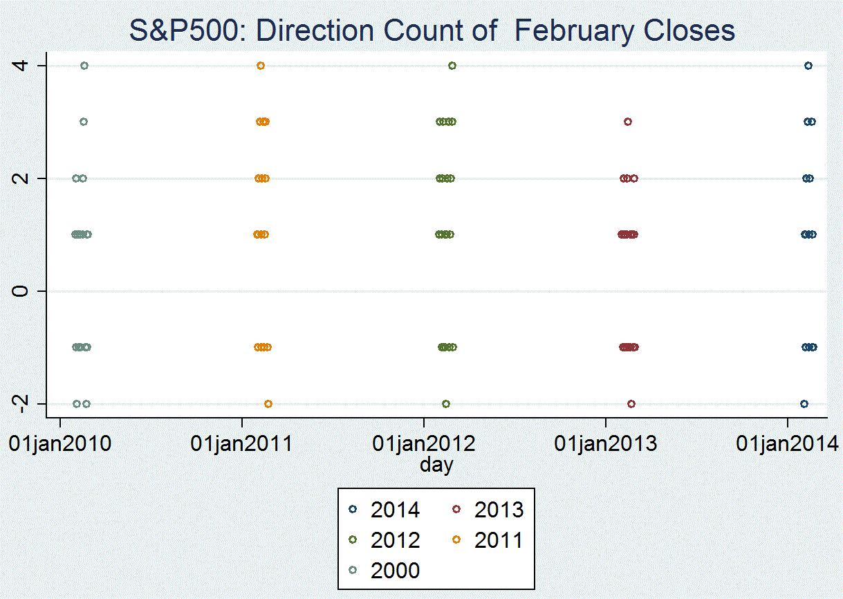
Prices changed direction again, declining after rising the day before. Given this bull market’s age and its clustering just below its January record high, we consider the pattern of daily price changes. The diagram shows the ‘frequency count’ in February for each of the past five years.
Reviewing this record reveals much similarity. The vertical axis shows the number of days prices move in the same direction, both up and down. The length of the horizontal lines indicates the number of days of the move.
Note that this year has the smallest distance, or the shortest line, at both plus one and minus one. This indicates that changes in the opposite direction –that is daily ups and downs- for 2014 are far less frequent than in any of the last four years. Accordingly, conclusions that daily price fluctuations indicate an imminent change in direction are inconsistent with the record.


