Archive for March, 2014

March 31, 2014 — Second Gain Follows Two Losses

Monday, March 31st, 2014

small latest logo

+2 +2 +2 after -2 -2 -2  03312014

Prices increased nearly one percent as the market posted its second straight gain after posting two consecutive losing days. Its last identical repeat was just days ago, on March 18. Identical patterns were posted three times last year, in November, August, and June.

Our diagram reveals that this combination occurs slightly more often in bull markets. Yet, on the following day, prices declined more often than they moved higher. Further, the market fell on the following day after each of the last four happenings.

DJIA .83 percent
NASDAQ 1.04 percent
S&P500 .80 percent
c max moszer

March 28, 2014 — Up Then Two Days Down Repeats

Friday, March 28th, 2014

small latest logo

+1 -2 +1 -2    previous on 10042013                03282014

Prices have now changed direction four times in the last six sessions – a pattern seen just 28 other days since January 1996. The last time this happened was on October 5 of last year – prices fell on the following day.

The rarity of this seesaw is extreme; if indeed prices increase on Monday, it will be for only the 13th occasion in the more 4,500 trading days of the last five up and down price cycles.
The diagram reveals, once again, the continuing frequency at or before market tops that have pervaded the pattern of recent closes.

DJIA .36 percent
NASDAQ .11 percent
S&P500 .48 percent
c max moszer

March 27, 2014 — NASDAQ/S&P500 Change Ratio at 2000Top and Now

Thursday, March 27th, 2014

small latest logo

nasdaq sp500 change ratio greater than 2.4  03272014

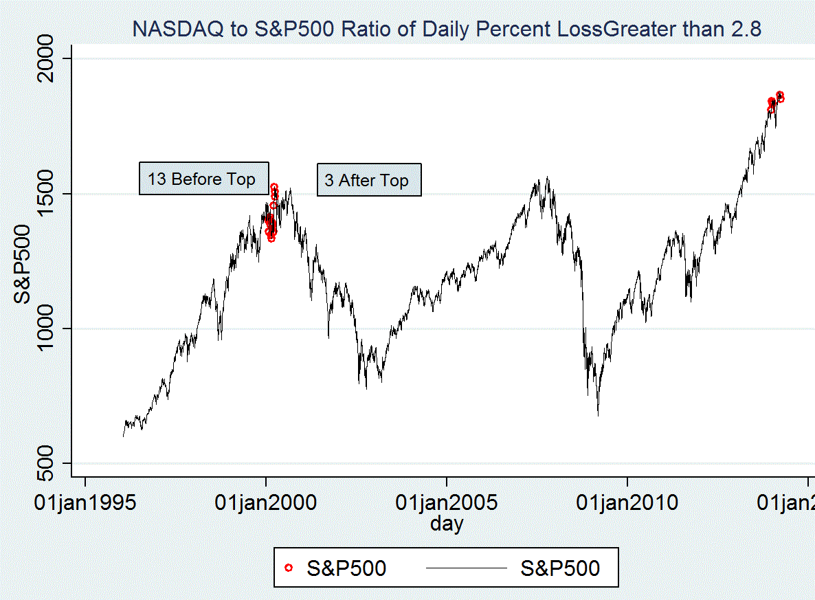
Once again the ratio of the percent declines of the NASDAQ and of the S&P500 mirror the disheartening history of the end of the 2000 bull market. This comes just three days after the earlier [NASDAQ/S&P500] change ratio came in at 2.4. Today that ratio of daily percent changes is 2.8.

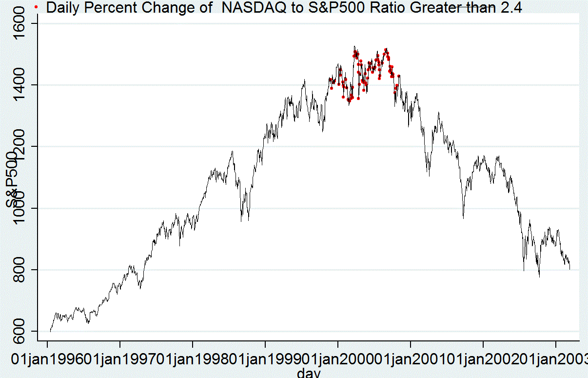
Our diagram plots these days – revealing 16 such days at that 2000 market high. Further, 13 occurred before that price reversal; these started to happen 43 days before that top; they continued until just eight days before the downturn. In addition, three came one, two, and four days after that high.

The more recent repeats came across the tape on December 19, 27, and 30; then on January 3. Shortly thereafter, on January 15, prices reached their record high. Though none occurred before the next high of March 5, another such day happened just three days ago; and now we have another repeat.

We repeat our warning of March 24: it does not seem reasonable that this simple ratio could be an indicator of bull market tops. Nevertheless, here is its history, showing the overwhelming majority of these closes happening in the twelve-month period from November 24, 1999 to November 2, 2000.Yet note that the 2007 market top occurred without this feature. In fact, the NASDAQ/S&P500 Change ratio maxed out at 1.89

DJIA -.03 percent
NASDAQ -.54 percent
S&P500 -.19 percent

March 26, 2014 — Prices Hover at March 7 High

Wednesday, March 26th, 2014

small latest logo

bull market tops  0 2 and 2014

The up-then-down market continues. Now 13 trading days after the record high on March 7, the averages continue to trade higher one day and lower the next: there have been 10 direction changes in the last 14 days. The result is the market’s failure to move above what now has become the latest maximum.

That may not be surprising given the fundamental shocks of Crimea, sanctions and then the missing airliner. Nevertheless, today’s diagram reveals the close conformity of the last 13 days with both the 2000 and 2007 bull market highs.

Obviously, this is not the final answer, yet – prices may continue to advance further, even though this expansion – now 1,269 trading days since its 2009 bottom – is the longest of this century.

DJIA -.60 percent
NASDAQ -1.43 percent
S&P500 -.70 percent

c max moszer

March 25, 2014 — Slight Gains Follow Two Declines

Tuesday, March 25th, 2014

small latest logo

+1 +1 +1   -2 -2 -2  +1 +1 +1    03252014

Prices recovered after two declines, and considering the increases of four days ago, the market pattern of ‘One Gain, After Two Declines, After One Gain’ looks good. This combination occurs just about as often when prices are moving higher as when they decline.

The frequency is also equal at market bottoms as at market tops.

Accordingly, today’s pattern provides little information about the future range of prices.

DJIA .56 percent
NASDAQ .19 percent
S&P500 .44 percent
c max moszer

March 24, 2014 — Today’s NASDAQ/S&P500 Change and the 2000 Market Top

Monday, March 24th, 2014

small latest logo

nrate  to  srate ratio greater than 2.4 at cyc 1 top and cyc2 start         03242014

Today’s large decline of the NASDAQ of -1.18 percent is more than twice as deep as the S&P500 loss of -.49 percent. That actual ratio is 2.4 – and this happened just 85 times since 1996. Further 80 of these coincide with the end of the 2000 bull market top and the beginning of the 2000/2003 bear market.

Today’s diagram focuses on that upper turning point – is it just coincidental that all these days happened in that short, but crucial, time?

It does not seem reasonable that this simple ratio could be an indicator of bull market tops. Nevertheless, here is its history, showing the overwhelming majority of these closes happening in the twelve-month period from November 24, 1999 to November 2, 2000.

We focus on this ratio because today’s repeat is the fifth since December 30, and just ten days since the last occasion on March 12.
Yet note that the 2007 market top occurred without this feature. In fact, during that bull market the NASDAQ/S&P500 Change ratio maxed out at 1.89.

DJIA -.16 percent
NASDAQ -1.18 percent
S&P500 -.49 percent
c max moszer

March 21, 2014 — Off Again, On Again Continues

Saturday, March 22nd, 2014

small latest logo

-1 +1 -1  03212014

Small declines followed yesterday’s small advances, which in turn came after a good positive day. This pattern of minus-plus-minus is not quite common, occurring about as often in bull markets as in declines. Today’s diagram shows just when this combination has occurred during the last five price trends.

They deserve attention, though, because they cluster at turning points. Further, their frequency seems equal at market peaks as well as troughs.

Prices on the following day moved down somewhat less often than they increased, and except for the 2000/2003 decline, gains outnumber declines.

DJIA -.17 percent
NASDAQ -.98 percent
S&P500 -.29 percent
c max moszer

March 20, 2014 — Prices at Bull Market Tops

Thursday, March 20th, 2014

small latest logo

proportion of 2000 2007 and March 7, 2014  tops    9 days after top     03202014

Today is the ninth market day since the S&P500 closed at its highest price on March 7. In that period, prices have gone up and down – but never broaching that pinnacle of 1878.04.
We have taken that high, and on assuming it the highpoint of the current bull market, compared it to the S&P500 performance at the market tops of 2000 and 2007.

Plotting the percentage of these tops for each of the following days reveals a startling similar pattern between the current S&P500 and the two past bull markets.

Of course, this is just comparing today’s situation with those at the end of previous market expansions. Nevertheless, it is astounding that the price changes of the past nine days coincide so closely with ends of the 2000 and 2007 expansions.

DJIA .67 percent
NASDAQ .27 percent
S&P500 .60 percent
c max moszer

March 19, 2014 — Decline Follows Fed Meeting

Wednesday, March 19th, 2014

small latest logo

2007 double top  03192014

Prices lost ground as the Fed released its new posture; the most important change is another cutback in its monthly open market purchases.

With prices remaining near their highs, we look at the profile of the last bull market top. Note that its a double peak, with prices falling almost three months before the market’s permanent decline.
Given that the earlier, 2000 bull market ended with an identical profile, it is reasonable to assume that the current expansion will face the same double top shape.

Thus, with prices still at their recent peak, any coming decline will be only a preview; the market then will recover before the bear market reversal.

DJIA -.70 percent
NASDAQ -.59 percent
S&P500 -.61 percent
c max moszer

March 18, 2014 — Prices Up for Second Day

Tuesday, March 18th, 2014

small latest logo

+2 +2 +2  -2 -2 -2      03182014

Substantial gains for the second day in a row sent prices to near new record levels. As it is, the S&P500 closing at 1872.25 reached 99.69 percent of its high on March 7.

Today’s pattern –two advances following two declines- last occurred on February 27. That next day saw the DJIA and the S&P500 moving higher for a third successive advance; but the NASDAQ moved down.

This combination occurs almost at the same rate during bull markets and bear markets. Yet, as the diagram reveals, this is a rare pattern, seen less than one percent of the time.

On the following day, prices tended to move higher more often than they declined.

DJIA .55 percent
NASDAQ 1.25 percent
S&P500 .72 percent
c max moszer